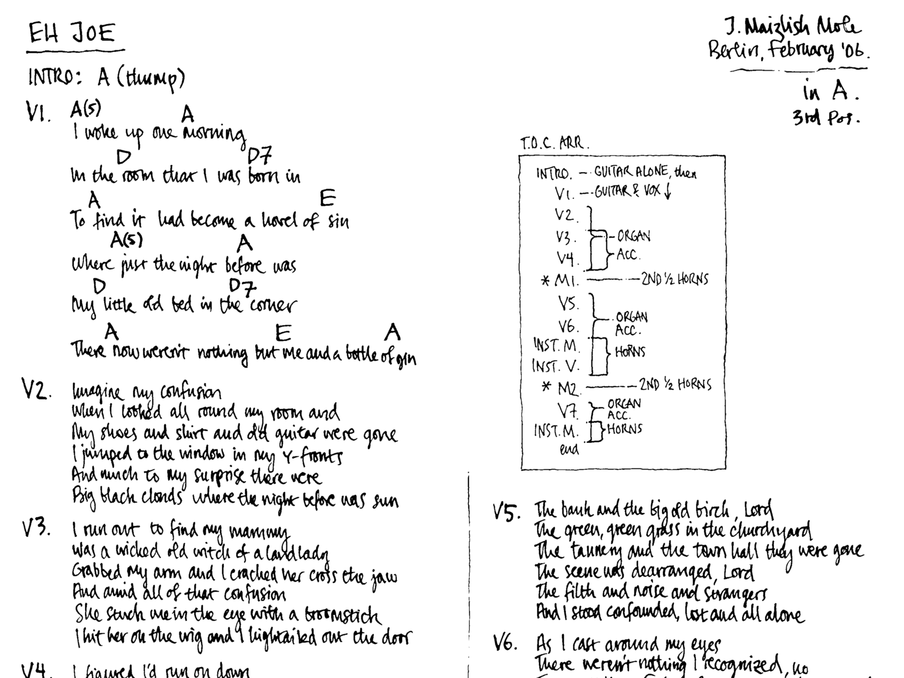
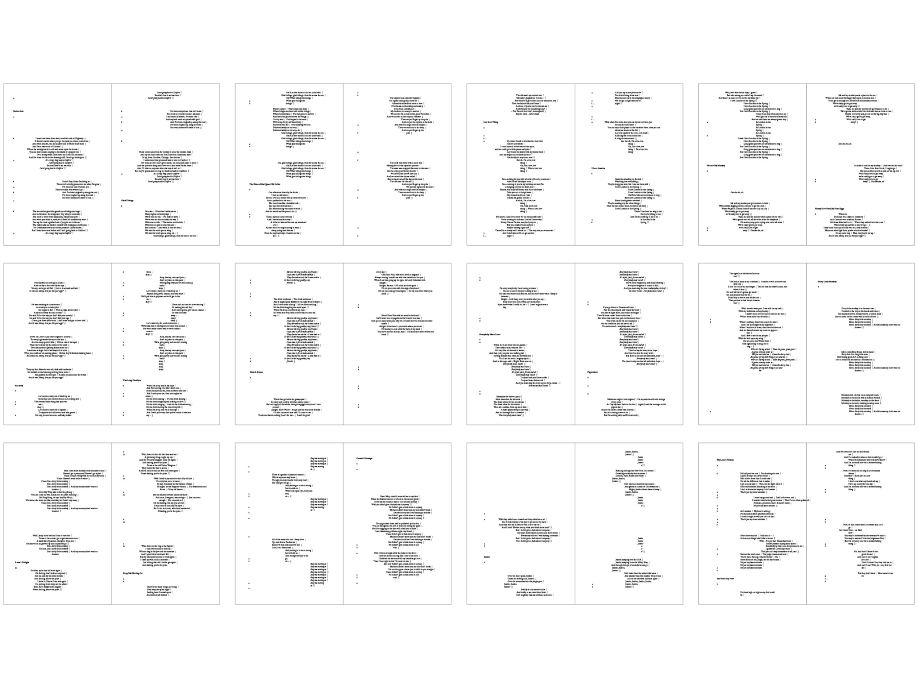
A 28 page book designed for a selection of J. Maizlish’s (artist, songwriter and band-leader) lyrics. The typographic concept visually conveys the time and duration of each song, with emphasis on their lyrical structures, including their often lengthy, wordless sections.

Maizlish’s original handwritten lyrics already suggested a typographic treatment by the way in which each song was clearly divided into its numerous sections (verses, choruses etc.). Each line of type represents a bar or two of music, with the number of beats per line identified on the left. This allows time and pace to be rendered proportionately on the page, and comparably between each track.

With reference to traditional poetry type-setting, the vertical rule denotes the separation between the original lines of verse, without interfering with the designated time signature of the setting.
Project initiated as a participant of Fraser Muggeridge‘s ‘Typography Summer School‘, July 2010
ISTD International Typographic Awards 2011; awarded a Certificate of Excellence
Typeface(s) in use:
- Block Gothic Std Demi Extra Condensed
- Adobe Caslon Pro Regular, Italic and Bold


