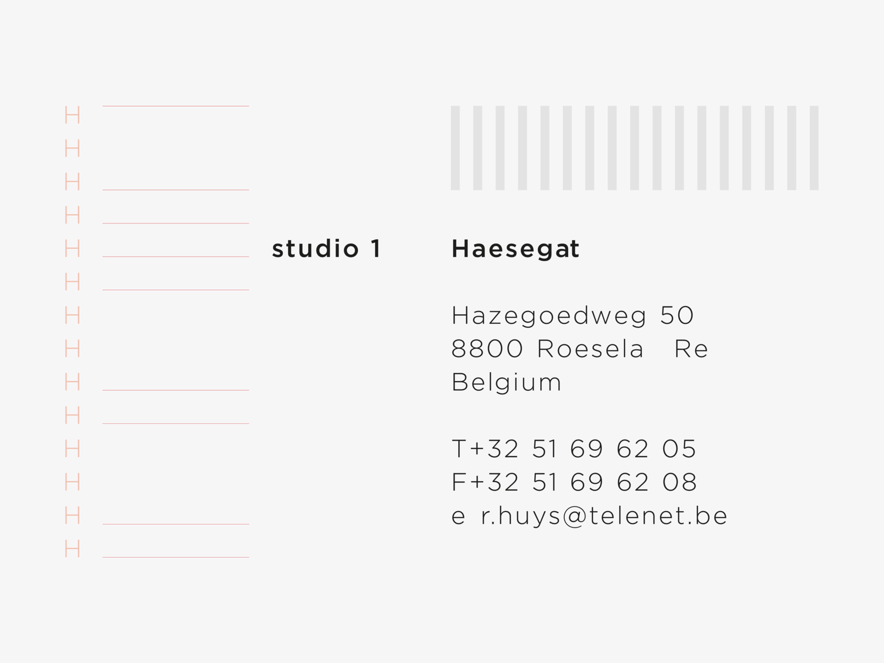
Working with Atelier Dreibholz, a typography and design studio, to create a dual-identity for Rita Huys; catering for both personal use and her professional practice, studio 1. By creating a visual mark based on the ‘Haesegat’ building — both Huys’s home and part of her identity as an architect – and the combination of clear, refined typography to define the identity’s double usage.
The 'Haesegat' building, Belgium

The visual mark and its construction
The construction of the visual mark is based upon the typographic baseline grid: height determined by that of three-lines, and the width reflects the proportions of the building itself. The width of each individual bar is at it’s minimum due to the limitations of the intended method of production, embossing.
Stationery: letterhead and business card
Typeface(s) in use: Gotham Light and Medium


