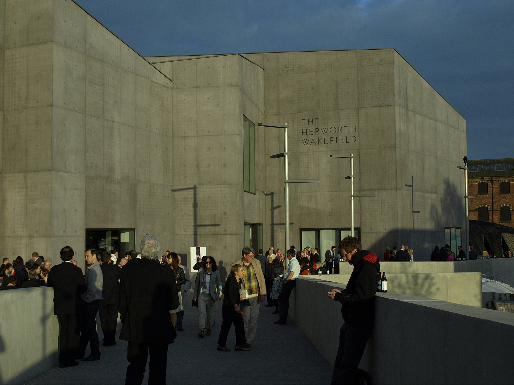
Working with A Practice for Everyday Life, a London-based design agency, to create a bespoke typeface for The Hepworth Wakefield – Yorkshire’s newest major art gallery, which presents exhibitions of international modern and contemporary art. The typeface’s form echo that of both the building’s angular shapes and with reference to physical forms of Barbara Hepworth’s work.

The typeface, which forms the basis of the identity, was created with an extensive character set, in six variants: three weights, each with an accompanying italic.


Used as the foundation for the gallery’s identity and to avoid cluttering architect David Chipperfield’s minimalist design for the building with unnecessary structures, the signage was applied directly to its surfaces. Walls were screen-printed and concrete sandblasted to create a quietly assertive scheme.


