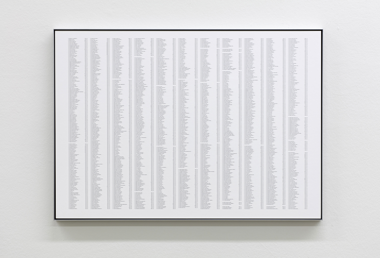
Susan Morris, an English artist based in London, with a particular interest in accumulated data (numerical, movement, typographical etc.), and translating findings into various mediums, including print and textile. In this instance, Morris provided a series of six concordances: alphabetical lists of the word ‘to’ + a ‘verb’ drawn from newspaper reportage on the so-called ‘happiest’ and ‘unhappiest’ days of the year; from 2005, 2010 and 2015.
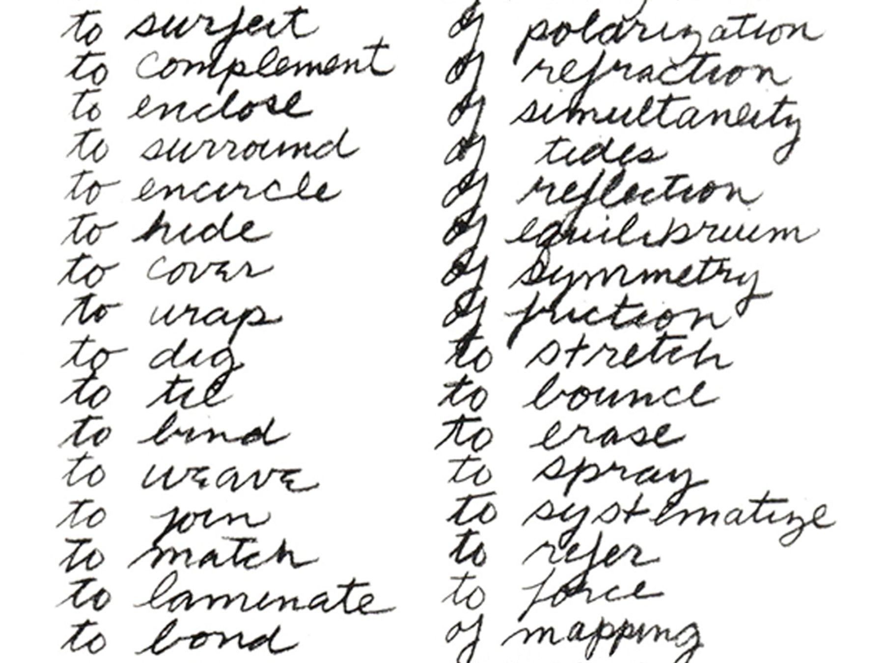
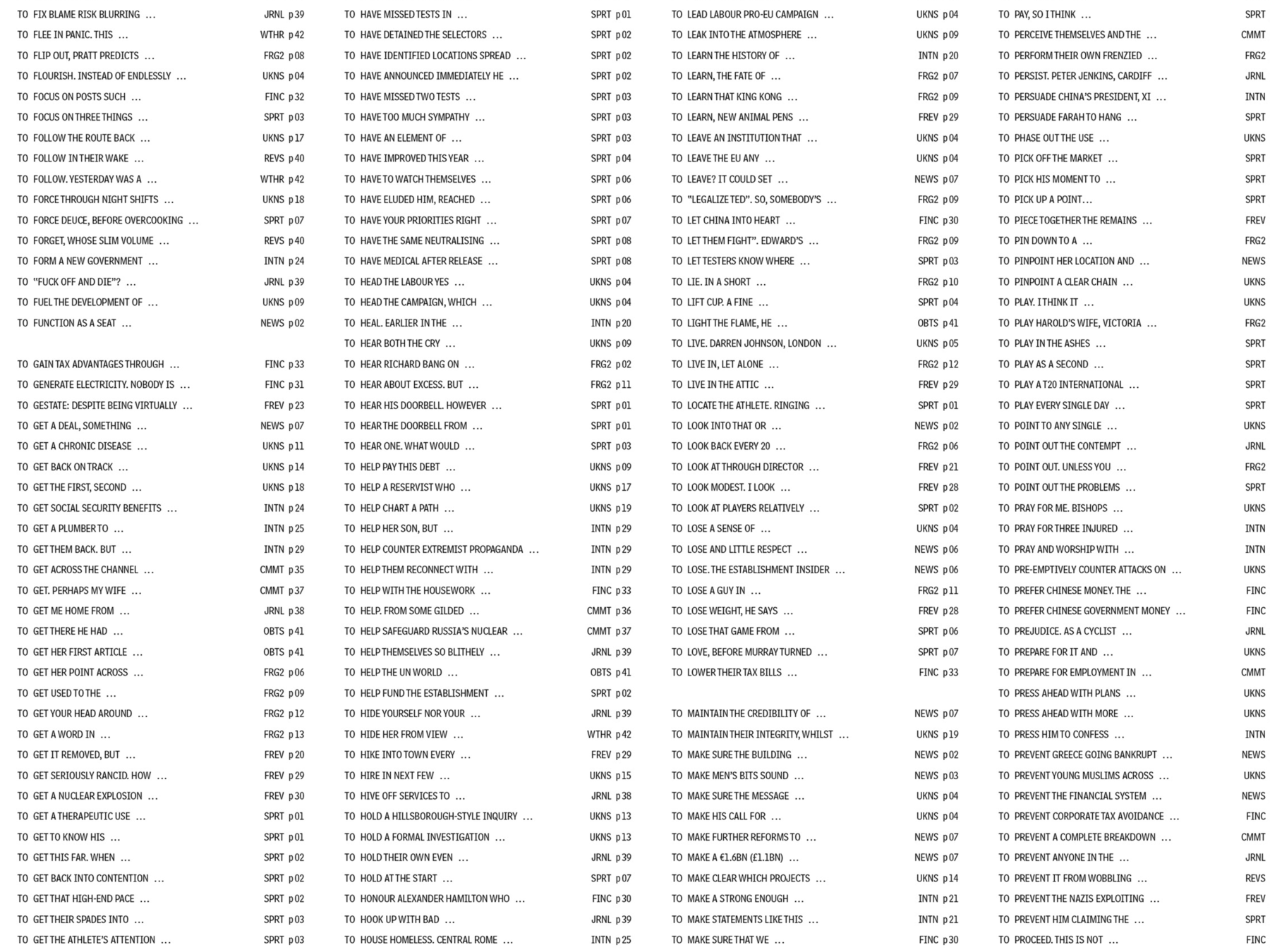
Morris had preferences for what was to be achieved visually, ‘I want the little phrases that emerge when you scan down the lines to be read. But I also want the concordances to be pleasurable to look at – ie they should nod in the direction of conceptual art but also towards pictorial abstraction. Iʼd like to play a bit with the spaces around and between the words to emphasise the typographical rivers (normally suppressed by a “good” graphic designer), thus drawing attention to something like the textʼs undertow.’
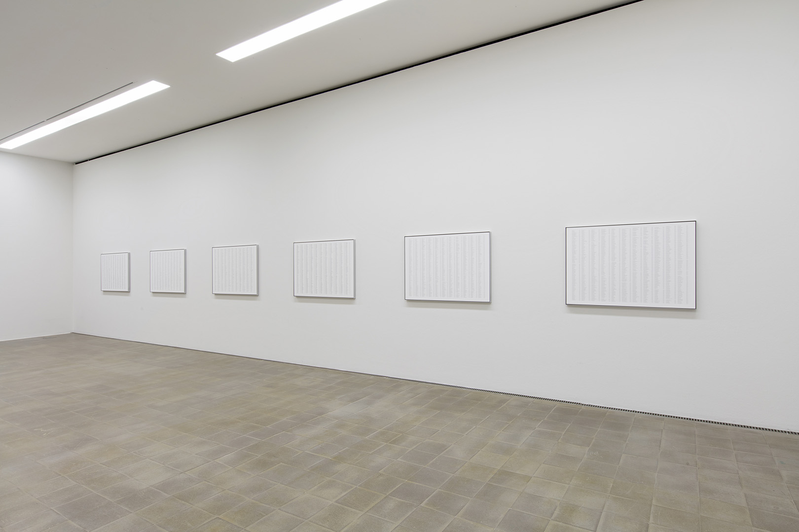
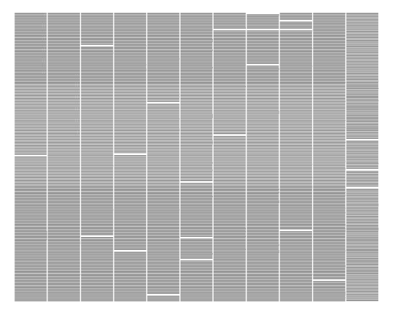
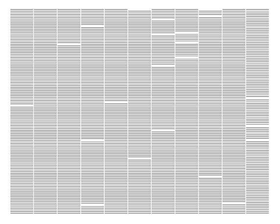
With Morris’ interest in automation, a typographic system was devised and applied across all six concordances, utilising Adobe inDesign’s ‘justified vertical alignment’ function to balance the lists across the 11 column grid. The difference in copy length is visible when viewing all six pieces together: the reduction in density of the eleventh column is clear with the increase of white space as a result of fewer and fewer printed words being used from year to year.
Typeface(s) in use: Bell Centennial Std Address
